Visualizing Geographic Statistical Data with Google Maps
This tutorial will teach you how to create a custom Google Maps based map for visualizing geographic statistical data. Such maps can be a useful tool when developing machine learning models. As a specific example case, we will create a map for visualizing the population density and median household income of postal code areas in Finland.
Geographic statistical data, such as economic and population related statistics, is collected into databases on national and regional levels by governmental and other agencies. The public availability of these statistics is appealing for the development of machine learning models, for instance, to predict how housing prices will evolve in the future.
A key part of any machine learning project is visualizing the input data. Google Maps is a natural tool to visualize statistics with a geographic aspect because a vast majority of people have a pre-existing familiarity with the platform. Why Google Maps you might ask and not some alternative service or library. I admit that this approach is probably overkill for static data plotting, i.e., if your intention is to create a map for a written report. However, using Google Maps for data visualization really excels if you want to create an interactive website, or even a fully fledged web app, and share it with others.
Let me start this post by showcasing the final map that we will build towards in this post. I’ve also included a short YouTube video below because screenshots don’t do interactive websites justice, as you might well imagine. You can find the code described in this post in full on GitHub in case you want jump right into the details and reproduce a working copy of the map. In the sections below, I will go through the main steps of the map creation process in more detail.
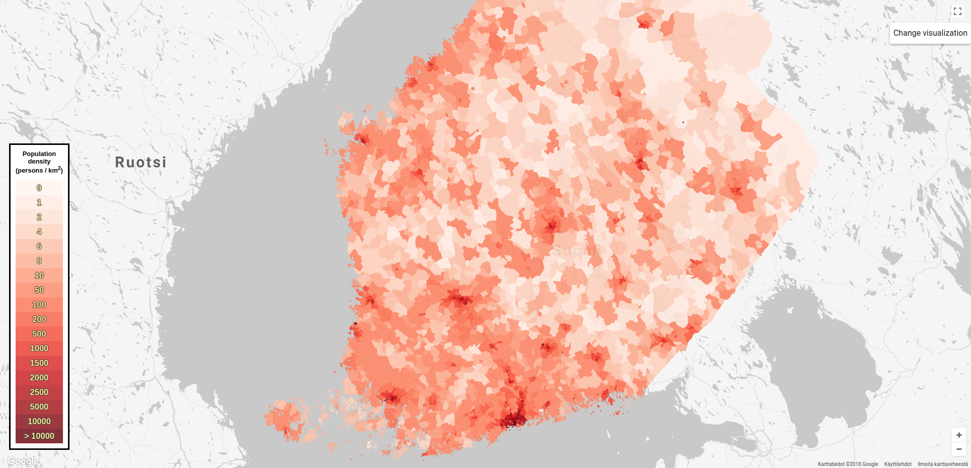


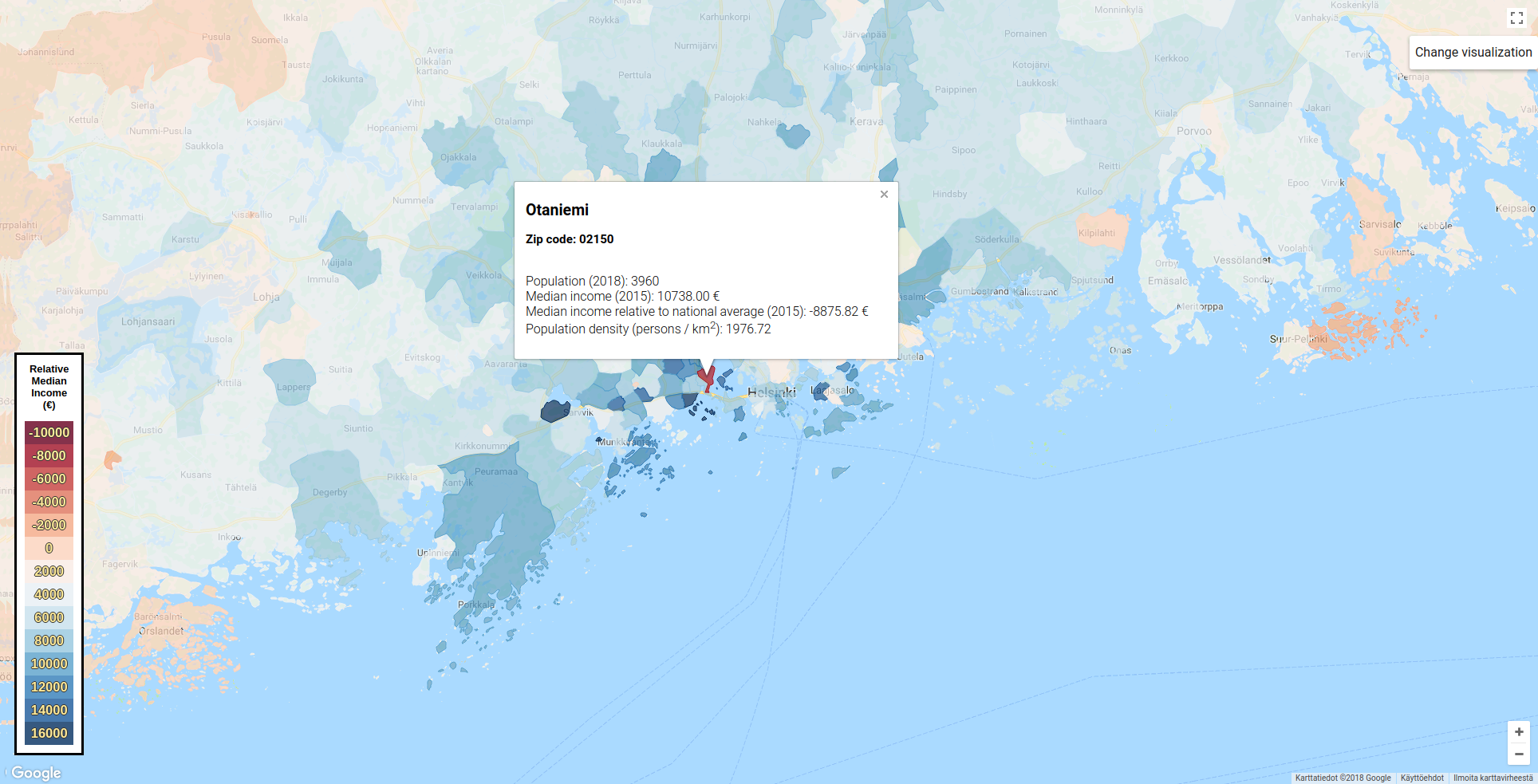
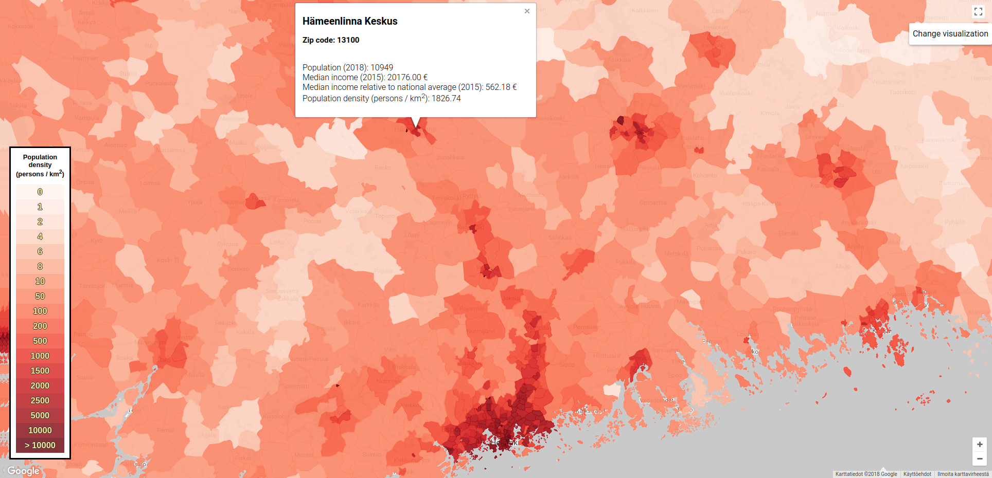
Table of Contents
Prelude: the Google Maps JavaScript API
While parts of the Google Maps Services are accessible natively through a Python client, building custom Google Maps or building apps on top of such maps is possible only through the JavaScript (JS) API. The documentation provides plenty of examples to familiarize you with the different functionalities of the API. No prior knowledge of JS is required.
Before you can get started on building your own Google Maps based maps, you need to obtain an API key by registering an account/project on the Google Cloud platform. Registration is free, although a credit card is required, as is using the actual Google Maps platform up to a 200 $ monthly credit limit. The free quota should be more than sufficient for small personal projects: I used about a dollars worth of quota while creating and testing the map described in this post. Actual quota usage depends on the number of calls to different components of the JS API, which can be monitored in real time via an online console. Pricing information for larger projects is available here if your interested.
Obtaining and processing geographic data prior to visualization
As mentioned in the introduction, I will be considering two different statistics in this post: the population density (in inhabitants/km$ \mathrm{^2}$, data from 2018) and the median household income relative to the national average (in €, data from 2015). The statistics will be visualized in geographic areas defined by Finnish postal code areas. The relevant raw data was downloaded from a public database hosted by Statistics Finland, the national statistical institution of Finland that collects, maintains and publishes roughly 160 sets of different statistics. The data used in this post was accessed through the Paavo - Open data by postal code area service, licensed under CC BY 4.0.
Mandatory license disclaimer. The statistics (population, population growth, median income) and postal code information (names, boundaries, areas) used in this post were downloaded from the Paavo portal, offered by Statistics Finland, licensed under CC BY 4.0. Data accessed July 27, 2018.
Before going through the actual data processing procedure, let’s first discuss how custom data can be included in Google Maps. The high-level object that can hold user created geographic data is the so called Layer object. There are several types of layers available, including Fusion Tables, KML elements, and the Data Layer container which can hold arbitrary geospatial data. I have opted for the last option, namely, the Data Layer container. The properties of this object can be defined and manipulated directly with JS, but a convenient alternative is to import the data from a GeoJSON file.
What’s a GeoJSON file you might wonder. Well, a GeoJSON file is many respects just a regular JSON file but with added objects to represent geographical features as points, lines, polygons and collections of these attributes. A postal code area, for instance, can be represented as a MultiPolygon object, which is a set of regular Polygon objects. With this object, it doesn’t matter if the zip code area is fully connected or whether it is made up of several disjoint sections (e.g. a group of islands). Additional variables can be declared and associated with these geometric features, allowing postal code specific statistical data to be encoded directly into this object. To illustrate how nifty this file format is, here’s an example of a shortened GeoJSON file (I used this tool to prettify the file and kept only two vertices of the Polygon object):
1 |
|
The GeoJSON file is a collection of Features which in this case correspond to the various Finnish postal code areas. Each Feature has two main components: a dictionary of properties (properties) and the geometry object which defines the postal code area MultiPolygon object in Google Maps compatible latitude/longitude coordinates. As you can see, we have defined a bunch of variables in the properties dictionary:
name,zipcode, surfacearea, population (pop2018), and median householdincomeof the postal code area. The data to populate these variables were obtained from the database discussed earlier in this post.income_relative: median income relative to national average (in €, with positive values indicating higher than average income)- population density
pop_density = pop2018/area - two fill colors
fill(representing relative income) andfill_density(population density): these will be used to color the postal code areas in Google Maps to illustrate how the quantities vary in different areas of Finland
All right, we have now covered how to define and include custom geographic data in Google Maps. We are ready to go through the actual steps necessary to create the map showcased at the beginning of this post. Here is the strategy that we will adopt
- Download and process data
- Save data as a GeoJSON file and upload data online
- Create JS for importing GeoJSON into Google Maps and subsequently visualizing the data
- Embed JS in a HTML file to create a working map as a website
Let’s first take a closer look at steps 1-2. I’ve used standard Python tools for these steps, namely, Pandas/GeoPandas/Numpy for downloading and processing the data and Matplotlib for creating the color schemes that will subsequently be used to color the different postal code areas in Google Maps. Overall, this process was quite straightforward but there were slight caveats I’d like to highlight below. You can find the code in full on GitHub.
The geographic statistical data was imported into a GeoPandas table by passing an URL to the
read_fileGeoPandas function. The URL represents a database call to the service discussed before, which returns data formatted as a JSON file. I filtered out all data columns that are irrelevant for this post using thefilter_columnsfunction defined below.1
2
3
4
5
6
7
8
9
10
11
12
13
14
15
16
17
18import geopandas as gpd def filter_columns(df, keep): """Filter Pandas table df keeping only columns in keep""" cols = list(df) for col in keep: cols.remove(col) return df.drop(columns=cols) def main(): # Get statistics from Statistics Finland portal for year 2018 keeping only the selected data columns url = "http://geo.stat.fi/geoserver/wfs?service=WFS&version=1.0.0&request=GetFeature&typeName=postialue:pno_tilasto_2018&outputFormat=json" keep_columns = ['nimi', 'posti_alue', 'he_vakiy', 'geometry', 'pinta_ala', 'hr_mtu'] data = filter_columns(gpd.read_file(url), keep_columns) # Rename columns data.rename(columns={'he_vakiy': 'pop2018', 'pinta_ala': 'area', 'nimi': 'name', 'hr_mtu': 'income', 'posti_alue': 'zip'}, inplace=True)In the original data set, the coordinates that represent the boundaries of the postal code areas were defined in the Finnish projected coordinate system (
epsg:3067). Google Maps supports only Lat/Long coordinates (epsg:4326), so I had to convert the coordinates to the correct coordinate system. As a reminder, the coordinates are stored in the MultiPolygon objects associated with each postal code area. The coordinate system was defined in theinitvariable in this data set (variable not shown above). The type conversion fortunately turned out to be a simple matter of calling the appropriate GeoPandas function1
2# Convert geometry to Google Maps compatible Lat/Long coordinates data.to_crs({'init': 'epsg:4326'}, inplace=True)The data set contained postal code areas with undefined median incomes (-1.0 or NaN). These postal code areas either had no inhabitants in 2018, or had too few inhabitants so that the income data was suppressed for privacy reasons. I simply set the relative median income in these areas to the national average to avoid visualization issues in Google Maps.
1
2
3
4
5
6
7# Income data in some postal code areas might be undefined (NaNs or -1.0) # In these areas, there are either no inhabitants at all, or too few inhabitans # so the income data is not shown for privacy reasons # Set the income in these regions to the national average data.replace(-1.0, np.nan, inplace=True) avg_income = np.nanmean(data['income']) data.fillna(avg_income, inplace=True)Once I had processed and saved the data to disk, it turned out that the size of the saved GeoJSON file was rather large (32 MB), which can be relatively slow to import into Google Maps. To reduce the file size slightly, I decided to round the median relative incomes and population densities to 2 decimal places. I was able to achieve a much larger file size reduction by rounding the coordinates of the postal code areas to four decimals from 15 decimal places. Reducing the coordinate precision did not appear to drastically decrease the quality of the postal code area boundaries, at least after a quick visual inspection in Google Maps. I used GeoPandas to round the former two quantities and the
ogr2ogrcommand line tool to round the coordinates. GeoPandas (or rather the underlying library) does not natively support reducing the precision of Polygon coordinates, and emulating this behavior in Python was quite cumbersome compared to using theogr2ogrtool. The final file size was 17 MB after rounding. I think it might be possible to further reduce the file size by removing redundant coordinates from the MultiPolygons with the GeoPandas simplify function, but I have not tested this option. Here are the commands I used to reduce the size of the GeoJSON file1
2# Round data to 2 decimal places to reduce size of resulting GeoJSON file data = data.round({'pop_density': 2, 'income_relative': 2})1
ogr2ogr -f "GeoJSON" -lco COORDINATE_PRECISION=4 map_data_reduced.json map_data.jsonI assigned discrete colors to the income and population density data with Matplotlib in order to visually distinguish how these quantities vary in different postal code areas in Google Maps. The colors were assigned by binning the data: the observed data range was first discretized into a set of $N$ bins, with each bin representing a range of values. The actual data was then assigned to these bins and an equally long color map vector was used to associate the bins with a color. I used the following code snippet to color the population density data.
1
2
3
4
5
6
7
8
9
10
11
12
13
14
15
16
17
18
19
20
21
22
23
24
25def pop_density_binning(return_colors=False): """Return bins and color scheme for population density""" # First bin is 0, next is 0.1-1, ..., final is > 10000 bins = np.array([0, 1, 2, 4, 6, 8, 10, 50, 100, 200, 500, 1000, 1500, 2000, 2500, 5000, 10000]) cmap = plt.cm.get_cmap('Reds', len(bins)+1) if not return_colors: return bins, cmap else: colors = [] for i in range(cmap.N): rgb = cmap(i)[:3] # will return rgba, we take only first 3 so we get rgb colors.append(matplotlib.colors.rgb2hex(rgb)) return bins, colors # Assign alternative colors for population density bins, cmap = pop_density_binning() colors = [] for i, row in data.iterrows(): index = bins.searchsorted(row['pop_density']) colors.append(matplotlib.colors.rgb2hex(cmap(index)[:3])) data['fill_density'] = Series(colors, dtype='str', index=data.index)In order to import the processed data into Google Maps, the data should be saved as a GeoJSON file. Turns out that outputting data into a pre-existing file is not possible in GeoPandas, even if your intention is to overwrite the original file. Such attempts will crash the file writing driver with a rather cryptic error message. I explicitly deleted the output file in case it already existed to avoid this crash.
1
2
3
4
5
6
7
8
9
10# Save data as GeoJSON # Note the driver cannot overwrite an existing file, # so we must remove it first import os outfile = 'map_data.json' if os.path.isfile(outfile): os.remove(outfile) data.to_file(outfile, driver='GeoJSON')
Creating a custom Google Maps based map
To recap, we have saved everything we want to include in our custom Google Maps based map in a GeoJSON file. We are now ready to go through the process of importing and visualizing this data using the Google Maps JS API. I will be adding the following elements on top of the standard Google Maps canvas:
- Restyled base map with reduced clutter (labels, markers, etc.)
- Data layer object created by importing data from the GeoJSON file. This file defines the postal code areas as Polygon objects, contains the population and income data, as well as the instructions for colorizing these areas based on the values of the aforementioned properties
- A clickable button that allows switching between the visualizations for the two data sets
- A clickable info window that displays additional information about the selected postal code area
- A legend which visually depicts how the values of the two properties vary in different parts of Finland
I’ll go through each step individually. Feel free to skip a head to the full code available here if you are already familiar with the Google Maps JS API.
1. Restyling Google Maps
The default view of Google Maps can be edited exhaustively with styling rules. A convenient interactive tool is provided online. I used this tool to create 2 different map styles for the median income and population density data. The styling rules are passed to the Google Maps constructor as a JSON object (variable named style below) and can be altered later on via the setOptions function. Various default visualization controls can be disabled with the same interface, see here for a complete list. This is the initializer I used
1
2
3
4
5
6
7
// Initialize map
var map = new google.maps.Map(document.getElementById('map'), {
  zoom: 10,
  mapTypeControl: false,
  streetViewControl: false,
  styles: style
});
2. Creating a Data Layer object and accessing its properties
This step is, without a doubt, the easiest step in the map creation process. Assuming that the GeoJSON file was uploaded somewhere in the public domain, say GitHub, the Data Layer object can be created by simply passing the URL of the hosted file to the loadGeoJson function. Getter and setter functions are available for accessing and manipulating the properties of the Data Layer object. Here is the code snippet I used for importing the data and setting the style of each postal code area Polygon object. By default (when useDensity = false), the postal code areas are colored based on the relative median income, while the actual color is stored in the variable fill. You might also notice that I am switching between different canvas visualization styles whenever the postal code areas are recolored.
1 |
|
2. Button for switching between visualizations
We have have imported two data sets into Google Maps, which both have their own distinct visualization styles. We need to create a button to switch between the data sets. Clicking this button should trigger a recoloring of the postal code areas and update the map legend (see below) so that it displays the correct information. To achieve this functionality in practice, I added a DOM listener to the button (google.maps.event.addDomListener), which detects when the button is clicked and triggers (google.maps.event.trigger) two custom map events that update the Polygon colors and the map legend. This step is best explained by the actual code. Notice that we iterate over the features of map.data (the postal code areas) and update the property useDensity which, as the previous section showed, controls the styling of the Polygon objects.
1 |
|
3. Info window
The Data Layer objects can contain significantly more information than can be visualized by simply coloring the corresponding Polygon objects. We can display additional information as a pop up info which can virtually contain anything. Here, we will simply display the numeric values of the variables we saved into the GeoJSON file. The info window is placed on top of an invisible marker that is positioned at the center of the selected postal code area. The Polygon object does not have a native getCenter function for computing the center point of the Polygon. The object must therefore first be converted to a LatLngBounds object which has the desired capability.
1 |
|
4. Legend
All right, nearly there. The final object we will add to the map is a color legend with two different color schemes and label sets. The colors and labels were defined by the Python script which we used to bin the corresponding statistical data. Instead of recreating these variables in JS, I decided to pass the values from Python to the HTML file that contains the JS code. The data is accessed in JS via named HTML div objects. With the label and color definitions available for use, it is a straightforward matter to draw and update the legend when necessary.
1 |
|
Final ingredient: Embedding JS in a HTML file
We have defined all the JavaScript elements that we wanted to include in our Google Maps based geographic data visualizer. The final step of creating a fully fledged Google Maps web page is to embed the JS code in a HTML file and to load the Google Maps JS API. I used a basic HTML template from the API documentation for this task, which you can find below. Note that I’ve left the Google Maps API key blank (YOUR_API_KEY_HERE). Opening this HTML file in a browser won’t, therefore, create a working map, unless you fill in your own API key to active the JS API. As you might have noticed, the API key is passed to the Google Maps API initializer via a parameter in the URL string.
When I actually want to load up the map in a browser, I have used this simple Python script to set the API key and output a new HTML file. The script also defines the colors and labels used in creating the map legend, a matter we discussed in detail in the previous section. If you define your API key in this file, you can use the same Python script to recreate the map showcased at the start of this post.
1 |
|